

The IPL 2023 is underway, and the tournament has delivered some exciting contests so far. A total of ten teams are there competing for the trophy again this year. It is challenging to predict the winner, considering each team has performed well so far. However, if you support a particular team, you probably believe they will emerge victorious and claim the trophy.
Being a die-hard fan of an IPL team is a challenging task. Each year teams make some significant changes to the squad, and then as a fan, you need to review these changes to understand how the new players will impact your favorite team's performance. Some franchises make changes to the jersey each year, and try to inculcate innovative ideas in their outfits. Nevertheless, team logos are typically left unchanged, as they represent a critical aspect of a team's identity that is rarely altered.
A logo is not just a symbol for a franchise; it tells a story that fans understand and resonate with. A well-designed logo can create an emotional connection with fans and help establish a sense of community. Additionally, a team's logo can have a significant impact on merchandise sales, as fans often want to show off their loyalty by wearing clothing or accessories featuring their team's logo. As a result, franchises often invest significant time and resources into developing and refining their logo to ensure that it accurately represents the team and resonates with fans.
Here, we have ranked the logos of all 10 IPL teams this season:
10. Lucknow Super Giants (7/10)
The logo of the Lucknow Super Giants contains a bat in the middle with a ball engraved in the center of the bat. The bat has wings on both sides, and the Indian Tricolour has been used as an inspiration for the color of the wings. The design of the wings has been inspired by the mythical bird Garuda, which has the ability to fly quickly. The bird Garuda can be found in all Indian cultures and sub-cultures.
The bat in the middle is blue in color, while the color of the ball is red with an orange seam. The design of the ball resembles the auspicious ‘jay tilak,’ which is associated with good luck in Indian homes. The tri-color in the wings has been used to represent the franchise’s Pan-India appeal. The logo has been heavily inspired by Indian mythology.
The logo has been carefully designed, and each element carries significant meaning. In their first year, the Sanjeev Goenka-owned team donned a aqua marine blue colored jersey and made it to the playoffs. This season, the color of the jersey has been changed to dark blue, but the logo remains the same. They had a flying start to the tournament as they overcame the challenge of Delhi Capitals before losing their second game to CSK.
9. Gujarat Titans (7.5/10)
The Gujarat Titans made their debut last season and won the trophy under the captaincy of Hardik Pandya. The team unveiled their logo in the metaverse last year. The logo is inspired by the shape of a kite that flies high in the sky, and the same happened in the first season as the team finished at the top of the table. Kite-flying is an integral part of Gujarat's cultural heritage, with festivities like Uttarayan when International Kite Festival is celebrated in Gujarat.
The logo also has a lightning bolt just below the name of the team. This represents the energy of the team and the ability to light up even the darkest skies in an instant. The same also symbolizes the team's determination to overcome difficulties and win, even when things get tough. This lightning bolt symbol is also there on the jersey of the team.
The colors used on the logo, navy blue, gold, and white, are also used in the jersey. The design of the logo is pretty simple and has a scope for a lot of improvements. The team is new to the IPL setup, so it will take some time for them to etch the significance of the logo on the mind of fans. Their logo might not present a strong case, but their jersey has been rated among the best in the tournament.
8. Mumbai Indians (8/10)
The Mumbai Indians made a few minor changes to their logo from their initial years in 2010, which is still in use. The logo has been heavily inspired by Sudarshana Chakra, attributed to god Vishnu in the Hindu scriptures. The franchise is known for consistent performances in the tournament and has won the trophy five times. The same consistency is present in their logo design as the original idea and colors are still in use.
The first logo of the team was created in 2008. The initial logo had the Chakra sign at the top of the franchise's name. The Chakra was in blue and yellow-to-red colors, with blue and red letters and white outlines. On the left side of the logo, two orange and green strokes were used to represent the Indian flag.
In 2010, the logo was updated with some minor changes and an enlightened color palette. The Chakra was turned in the opposite direction from the original logo. In the initial logo, the sharp blades on the Chakra were turned to the left, while in the new logo, it can be seen swirling to the right side. The orange and green strokes, which were only one side of the Chakra, are now on both sides in the new logo.
7. Rajasthan Royals (8/10)
The Rajasthan Royals created history when they won the inaugural edition of the tournament under the leadership of the great Shane Warne. In their debut season, the logo had blue and gold colors on it. The team's mascot was a lion called Moochu Singh, and the same was present on either side of the logo. Two inverted Rs were present in the middle, along with a crown on the top.
In 2009, they made some changes to their logo, reducing the amount of gold color and making blue the primary color. Only the two Rs, team name, and mascot were kept in gold color. In 2018, when the team returned to the tournament after a two-year ban, they used this same logo again.
The Rajasthan Royals made a major shift in their logo in 2019, bidding farewell to the earlier color scheme and adopting a new pink logo. The crown from the team's first-ever logo was reintroduced, but the mascot was removed. Jaipur is known as Pink City, which justified the new logo shift. Also, the color was used to spread awareness for cancer.
6. Punjab Kings (8/10)
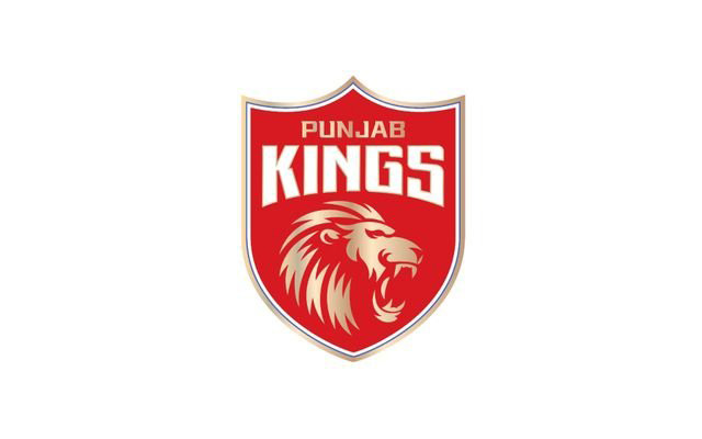
The franchise was known as Kings XI Punjab earlier and changed their name to Punjab Kings before the 2021 edition of the Indian Premier League. Despite the name change, the team has consistently combined red and white colors in the logo, while gold color was introduced later. The team's primary logo has been inspired by a shield, and the current logo reflects this.
The older logo featured two lion heads facing in opposite directions, which was replaced with a single lion image in the current logo. The golden lion is in the logo's center against a solid red background. The franchise's name is now placed in the upper section of the logo in two different lines. The name is etched using different styles and colors, with gold and white being used.
This season, the Punjab-based franchise announced Shikhar Dhawan as their captain and won the opening game against the Kolkata Knight Riders by seven runs. They posted a total of 191 runs for the loss of five wickets with the help of a half-century from Bhanuka Rajapaksa. Arshdeep Singh picked three wickets for 19 runs in three overs and was adjudged Player of the Match. The Kings have never been successful in winning the trophy, and they will be hoping to change this record under a new captain.
5. Delhi Capitals (8.5/10)
The Delhi-based franchise was known as Delhi Daredevils until the 2018 season. In December 2018, the name was changed to Delhi Capitals. The reason for this name change was that Delhi is the country's capital and power center. Hence, the word Capitals was incorporated into the name as the franchise aimed to be the center of all action in the league.
Unlike Punjab Kings, the name change brought many changes to the team, as red was the primary color in the logo earlier and was replaced with blue. In the logo's center, there are three tigers, a combined work of two national symbols. Tiger is the national animal of India, while the Lion Capital of Ashoka is the national emblem, which has four lions in it, but only three are visible from the front. At the top of the logo is a dome-like structure inspired by the design of the Parliament of India located in New Delhi.
The Capitals have reached the playoffs thrice in the last four seasons. They ended up as the runner-up in the 2020 edition of the tournament as they lost the final against Mumbai Indians. This year, David Warner has been named as the team's captain in place of Rishabh Pant, who has been ruled out of the tournament. Axar Patel, the Indian all-rounder, has been promoted to the vice-captain position.
4. Sunrisers Hyderabad (8.5/10)
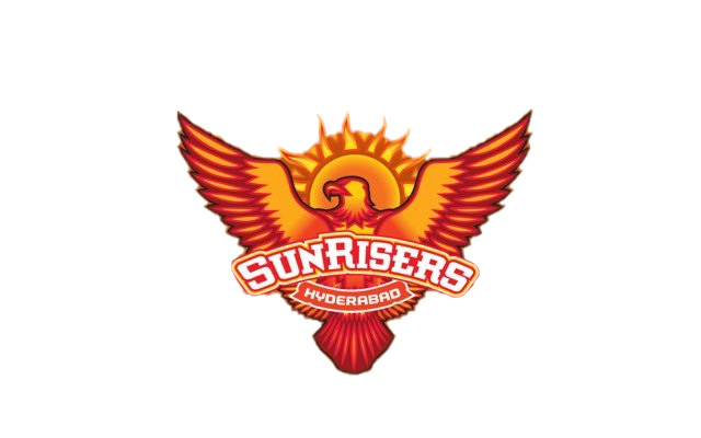
The Hyderabad-based franchise made their IPL debut in 2013 and went on to clinch the trophy in 2016. In their ten appearances in the tournament so far, SRH have qualified for the playoffs six times and reached the final twice. Last year, they finished in the 8th place in the IPL 2023 table with six wins in 14 games. This season, they have named Aiden Markram, the captain, and Brian Lara, the head coach.
The franchise has used orange and yellow as the primary colors in their logo. The logo is a striking symbol of the team's fearless and ambitious spirit. It features an eagle, one of the most powerful and majestic birds, set against the backdrop of a rising sun. It conveys that the team is ready to take flight and soar to new heights of success, just like an eagle soaring through the sky.
Eagle represents strength, speed, and fierce determination, all essential qualities to succeed in a league as competitive as the Indian Premier League. The rising sun in the background adds an extra layer of symbolism, representing a new dawn and a fresh start for the team. The combination of the eagle and the sun creates a powerful and dynamic image that embodies the team's fighting spirit and determination to win. The logo is a bold and inspiring symbol that reflects the team's aspirations and commitment to excellence.
3. Royal Challengers Bangalore (9/10)
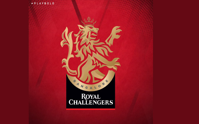
The Royal Challengers Bangalore made their IPL debut in 2008 with a round logo and was used for the first seven years of the franchise in the tournament. At the top, a colossal crown made of silver, gold, and red color was positioned. The letter "RC" was written in the center and took up a significant amount of space. The name of the franchise was also included in black color on a golden frame around the logo.
In 2016, the franchise updated the logo with a more modern look by reducing the size of the letter "RC." The black color was used in the major regions of the logo. They replaced the crown with a golden lion in a black outline at the top of the logo. The name of the franchise was again written in the same font and size on the golden frame of the logo.
In 2020, the franchise unveiled a new logo and moved away from the circular shape. The new logo features a light gold lion positioned at the top, larger than the lion in the previous logo. The word "Bangalore" is written separately at the top in black, underneath the lion. The name "Royal Challengers" is written in white, on two levels, at the bottom of the logo, with a red underline. The new logo features a more modern and sleek design and uses a combination of gold, black, red, and white colors.
2. Chennai Super Kings (9/10)
The Chennai Super Kings have one of the most iconic logos in the history of the Indian Premier League. They have not made any significant changes to the logo, and the same has been in use since the start of the tournament. CSK's logo features a powerful, roaring lion that embodies the team's strength, courage, and unwavering determination to succeed in every game. The team's name is in blue, with a crown on top.
The color yellow, which forms the backbone of the CSK logo, adds a touch of warmth and vibrancy to the brand. It also instills a sense of hope and optimism among the players and fans alike. Whether it's the fierce lion or the striking yellow color, the CSK logo contains the team's fiery spirit and their implacable pursuit of excellence in the game of cricket. Much like the powerful king of the jungle, the lion, Chennai Super Kings have established themselves as one of the dominant forces in the Indian Premier League.
They have won the IPL four times and the Champions League twice under the leadership of MS Dhoni. Last season, they finished in the second-last place with just four wins in 14 games. They lost the season opener against Gujarat Titans by five wickets. But they came back stronger in the second game against Lucknow Super Giants and won by 12 runs.
1. Kolkata Knight Riders (9.5/10)
The Kolkata Knight Riders are the third-most successful franchise in IPL's history and have one of the most legendary logos ever. In 2008, the franchise unveiled an iconic Viking helmet which was used in the logo as well. The initial logo had a blazing helmet against a black background with the name in gold written next to it. In 2010, the black color was replaced with purple color.
The current logo came into existence in 2012. The Viking helmet was replaced with a Corinthian one. The combination of purple and gold was chosen with great thought and purpose. Purple is a color long associated with royalty, while gold represents the team's strength, power, and energy.
The logo has become a legendary symbol of the franchise's success in the Indian Premier League. It can be spotted on everything, from team jerseys and merchandise to the streets of Kolkata during the IPL season, proudly displayed by fans and supporters alike. As one of the most recognizable logos in the IPL, the KKR emblem has become a source of pride for fans and players alike. It is a constant reminder of the team's legacy and its unwavering commitment to excellence, both on and off the field.
CricTracker Desk