Tokyo 2020 unveils new logo

Tokyo, April 25
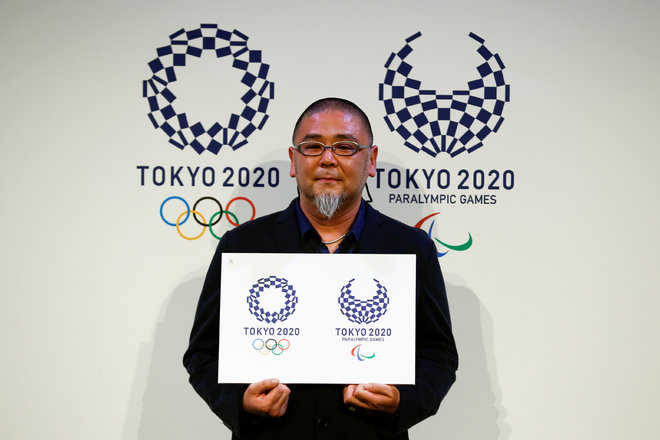
Tokyo 2020 organisers unveiled a new Olympics logo featuring traditional Japanese designs on Monday, seven months after they were forced to scrap the original motif over accusations of plagiarism. The new logo, chosen from more than 14,000 candidates, adopts a traditional indigo-blue chequered pattern called “ichimatsu moyo” that dates back to the Edo period (1603-1868).
The individually-shaped rectangles in the design represented differences in culture and nationalities and symbolised “unity in diversity”, the committee that chose the emblem said.
“It took me a long time to create this logo — it’s like my own child,” Tokyo-based artist Asao Tokoro, who designed the winning emblem, told a packed news conference. “I can’t be an athlete but I have felt a longing towards the Olympics since I was a child, and thought I can be involved through design.”
A dispute over the original logo erupted soon after it was unveiled last July, when a Belgian-based designer said it was too similar to his emblem for a theatre, demanding its use be halted and filing a lawsuit in local court. The logo’s designer Kenjiro Sano and Tokyo 2020 organisers denied the pattern had been copied but eventually scrapped it, saying its reputation was damaged. — Reuters